Small Decor Changes That Make Any Room Look Bigger
You do not need to knock down walls or hire a contractor to make a small room feel more open. A few well-chosen small decor changes can make a room look bigger than you ever expected — and most of them cost very little.
- Why Small Rooms Feel Cramped (And What’s Actually Causing It)
- Light Colours and Paint Choices That Open Up a Room
- Why Painting the Ceiling a Lighter Shade Than the Walls Adds Height
- Matching Trim and Walls to Reduce Visual Interruption
- Mirror Placement Strategies That Genuinely Work
- Where to Place a Mirror for Maximum Space Effect
- Large Single Mirror vs. Multiple Smaller Mirrors: Which Works Better?
- Furniture Layout Rules for Making a Small Room Feel Larger
- Why Pushing Furniture Against the Wall Often Backfires
- Choosing Furniture with Legs to Show More Floor Space
- Decluttering as a Design Tool, Not Just a Chore
- The One-Surface Rule for Visual Breathing Room
- Organising Vertical Space Without Adding Visual Weight
- Lighting Changes That Make a Room Feel Twice as Big
- Using Uplighting to Draw the Eye Toward the Ceiling
- Natural Light Maximisation Without Structural Changes
- Small Room Ideas Using Rugs, Patterns, and Textiles
- Storage Solutions That Keep Space Looking Open
- Multi-Function Furniture That Earns Its Footprint
- Wall-Mounted and Floating Storage to Reclaim Floor Space
- Small Changes, Big Difference
The truth is, most small rooms feel cramped not because of their actual size, but because of how they are arranged, lit, and filled. Shadows, clutter, and the wrong furniture placement are doing far more damage than the square footage itself.
This guide walks you through every practical fix — from mirror placement and light colours to furniture layout, storage, and lighting — so you can start seeing a difference without waiting for a renovation budget.
Why Small Rooms Feel Cramped (And What’s Actually Causing It)
Before you change anything, it helps to understand what is making the room feel tight in the first place. A small room does not always feel small because it is small. It feels small because of specific visual cues your brain picks up and interprets as “not enough space.”
Those signals come from a handful of predictable sources: too much competing visual information, poor lighting that flattens surfaces, furniture that blocks sightlines, and colour choices that absorb light rather than reflect it. When you know which of these is your main problem, you can fix it directly instead of guessing.
Spatial perception is not magic. The brain reads depth, height, and width through contrast, light, and unobstructed sightlines. Anything that interrupts those readings makes the room feel smaller than it measures.
The Role of Visual Clutter in Shrinking a Space
When too many objects compete for attention at eye level, the brain perceives the room as busy and crowded — regardless of the actual floor space available. Mismatched patterns, too many colours, and multiple focal points all work against each other.
Think of a bookshelf packed with random objects: loose papers, small figurines, stacked items in different colours, and a trailing plant. Now picture the same shelf with books grouped by colour, two or three intentional objects, and clear space between groups. The second version does not just look tidier — it reads as physically larger because the eye has room to travel.
Clutter creates visual noise. Visual noise signals “too much in too little space” — and that is the feeling you are trying to undo.
How Poor Lighting Makes Walls Feel Closer Together
A single overhead light source is one of the most common reasons a room feels smaller than it is. One central ceiling fixture casts downward light that creates heavy shadows along the lower walls and corners, pulling those surfaces visually inward.
Layered lighting solves this. When you add a floor lamp in the corner, a table lamp on a side table, and perhaps a wall-mounted light at mid-height, the light spreads to fill the room at multiple levels. The eye moves around the space rather than staying fixed under one bright point, and the room reads as deeper and wider.
A simple test: turn on only your overhead light and look at the corners. Then add a floor lamp pointing upward in the far corner. The difference in perceived room size is immediate.
Light Colours and Paint Choices That Open Up a Room
Colour is one of the most accessible tools available because it requires nothing more than paint and a weekend. Light colours work because they reflect more light into the room, which reduces shadow and creates the impression that the walls are further away than they are.
Dark colours absorb light. When a wall absorbs light rather than reflects it, it appears to advance toward you visually. This is why a room painted in deep charcoal or navy feels more enclosed, even if it is the same size as one painted in soft white.
The most reliable colours for small rooms fall into the warm neutral and cool neutral families: soft white, warm greige (a mix of grey and beige), pale sage, light stone, and soft powder blue. These tones reflect light without reading as cold or clinical, and they work across different lighting conditions throughout the day.
You do not need to paint every wall the same colour. A tonal approach, where you use shades from the same colour family across walls, ceiling, and trim, creates a continuous visual flow that makes the room feel larger than a high-contrast scheme.
Why Painting the Ceiling a Lighter Shade Than the Walls Adds Height
Most people paint their ceilings white and leave it at that. But if your walls are already a light neutral, a ceiling that is one or two shades lighter than the walls creates a gradient that draws the eye upward, which makes the ceiling feel further away.
This is the ceiling-as-fifth-wall concept: the ceiling is not just a structural surface; it is part of the visual room. When it reads as higher, the whole room feels taller.
The opposite is also worth knowing. A dark ceiling in a small room can feel oppressive rather than dramatic unless the room has generous natural light and the walls are kept very light to compensate. In most small spaces, a dark ceiling is a risk not worth taking unless you are specifically trying to create an intimate mood.
Matching Trim and Walls to Reduce Visual Interruption
Contrasting trim is one of the most underestimated ways a room gets cut into smaller visual sections. When skirting boards, door frames, and window architraves are painted a sharply different colour from the walls, they create clear visual breaks. The eye stops at each one.
Painting the trim the same colour as the walls, or within one tone of it, removes those stops. The eye travels continuously from floor to ceiling and from corner to corner without interruption, and the room registers as a single, larger space rather than a series of divided sections.
A practical example: walls in warm ivory, with skirting boards and door frames painted in the same warm ivory or a slightly lighter version of it. The room immediately reads as cleaner, calmer, and more open — without any furniture or layout changes at all.
Mirror Placement Strategies That Genuinely Work
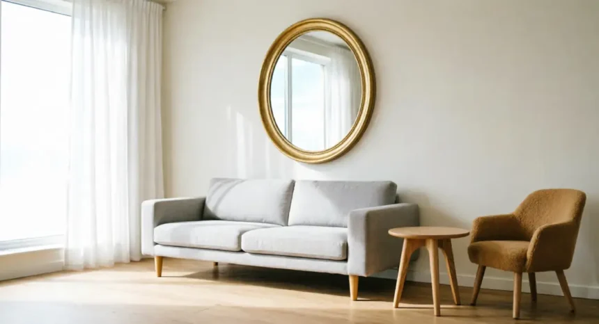
Mirrors are one of the oldest space tricks in interior design, and they still work — but placement is everything. A mirror in the wrong position does nothing. A mirror in the right position can make a small room feel twice as deep.
The core principle is simple: mirrors bounce light and create the illusion of depth by reflecting what is in front of them. If what is in front of them is a bright window or an open space, the reflection reads as an extension of the room. If what is in front of them is a cluttered shelf or a blank wall, the effect is cancelled.
Where to Place a Mirror for Maximum Space Effect
The single best position for a mirror is directly opposite or adjacent to a natural light source. When a mirror faces a window, it captures daylight and throws it back across the room. The room appears lit from two directions, the shadows reduce, and the reflected image of the window reads as a second window.
For a small living room: a large mirror on the wall directly opposite the main window, at eye level, anchored above a console or sideboard. The reflection of the window and the outdoor view adds visual depth that no paint colour can replicate.
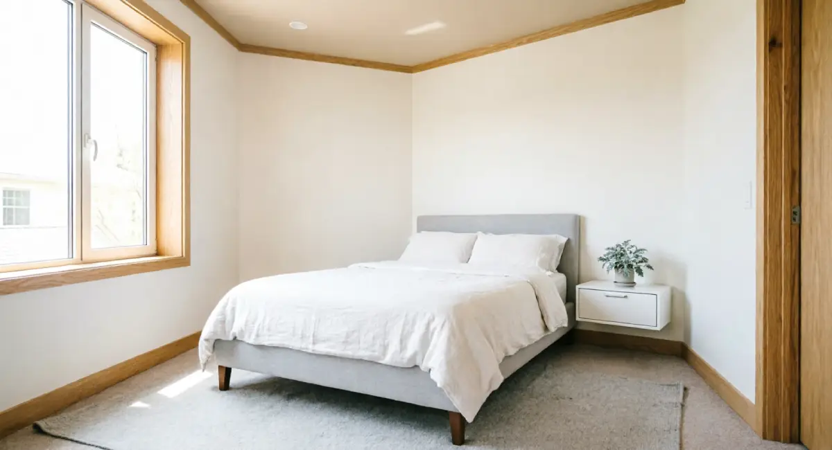
For a small bedroom: a floor-length mirror on the wall beside the window, or on the back of the wardrobe door, captures light and adds the impression of an extended space without taking up any floor area.
The one position to avoid: facing a wall with no light source or a cluttered surface. A mirror reflecting clutter doubles the clutter visually. Always reflect on something that helps.
Large Single Mirror vs. Multiple Smaller Mirrors: Which Works Better?
A single large mirror creates a clean, uninterrupted sense of depth. It reads as a window or opening, and the brain processes it as extra space. This is generally the stronger choice in a small room where simplicity matters.
A gallery arrangement of smaller mirrors can work well as a decorative feature, but it tends to fragment the eye rather than create the same sense of depth. Multiple frames, multiple reflections, and multiple visual points of interest compete with each other. In a small room, that competition is the same problem you are trying to solve.
The practical guide: if your wall space allows for a mirror that is at least half the width of the wall, go large and single. If you only have a narrow gap between a door and a window, a tall, slim mirror fills the space cleanly. Reserve grouped small mirrors for rooms that already feel generous.
Furniture Layout Rules for Making a Small Room Feel Larger
The way you place furniture changes how a room feels more than almost any other decision. Most people arrange furniture by instinct, pushing pieces to the edges to “save space.” That instinct is usually wrong.
What actually makes a small room feel larger is keeping sightlines clear, showing as much floor as possible, and creating a sense of depth in the centre of the room rather than along the perimeter. These are things that furniture placement controls directly.
Why Pushing Furniture Against the Wall Often Backfires
It seems logical: push everything back and free up the centre. But when all furniture lines the walls, the middle of the room becomes an empty void surrounded by a dense border of objects. That arrangement reads as awkward and, counterintuitively, makes the room feel smaller.
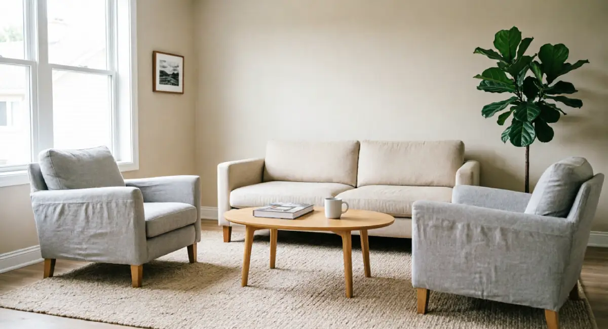
Floating a sofa 5 to 10 centimetres away from the wall creates a visual gap between the furniture and the wall. That gap signals depth. The brain reads the space as having more layers — furniture in front, space behind, wall beyond — which registers as a larger room.
Compare the two: a sofa pushed flush against a wall creates one flat plane. A sofa floated slightly creates three visual layers. The second layout feels more considered, and it genuinely reads as more spacious.
Choosing Furniture with Legs to Show More Floor Space
The amount of visible floor area has a direct effect on how large a room feels. When furniture sits flush with the floor, it reads as heavy and grounded, and the floor area disappears beneath it.
Furniture with legs changes this. A sofa on tapered wooden legs, a chair on slim metal legs, or a bed frame with visible clearance underneath allows light and sightlines to pass under the furniture. The floor reads as continuous beneath the pieces, and the room feels more open.
A skirted sofa or a bed with a base that reaches the floor hides the space beneath and makes the furniture feel heavier and more space-consuming than it actually is. If you are buying new pieces for a small room, exposed legs should be near the top of your checklist.
Decluttering as a Design Tool, Not Just a Chore
Decluttering is usually framed as a cleaning task, something you do before guests arrive or at the start of a new season. But in a small room, it is an active design decision with a measurable visual effect.
Every object you remove from a surface or a shelf is a visual interruption you are eliminating. The fewer interruptions, the more freely the eye moves around the room. The more freely the eye moves, the larger the space feels. This is one of the most cost-free small decor changes that makes a room look bigger, and it works immediately.
The key is being intentional rather than minimal for its own sake. You are not removing personality from the room. You are removing the noise that is preventing the room from reading at its best.
The One-Surface Rule for Visual Breathing Room
A practical way to think about surface styling: each surface should hold no more than two or three intentional objects, with clear space around them. That applies to the coffee table, the sideboard, the windowsill, and the bedside table.
When every surface is fully loaded, the room reads as chaotic regardless of how attractive each item is. A beautiful ceramic vase surrounded by three other items, a candle, a pile of books, and a remote control, becomes invisible in the noise.
The same vase on its own, or paired with one other object and surrounded by clear surface space, draws the eye and signals calm. Negative space is not empty — it is the thing that makes the objects around it visible and the room feel open.
Organising Vertical Space Without Adding Visual Weight
Not all storage creates the same visual problem. A wide, squat storage unit placed against a wall uses floor area and draws the eye across the bottom half of the room, which makes the room feel lower and more cluttered even when it is technically tidy.
A tall, narrow bookshelf or high wall-mounted shelving does the opposite. It draws the eye upward, which makes the ceiling feel higher, and it uses the vertical space that is almost always underused in small rooms.
A useful styling tip for vertical shelving: keep the lower shelves lighter in terms of both content and colour. Heavier, darker items at the bottom visually ground the shelf. Sparser, lighter arrangements higher up draw the eye upward and make the wall feel taller than it is.
Lighting Changes That Make a Room Feel Twice as Big
A single overhead ceiling light is functional, but it is the least effective lighting setup for making a small room feel open. It casts one pool of light downward, leaves the corners and lower walls in shadow, and creates a flat, one-dimensional look that makes the room feel like a box.
Layered lighting changes the entire character of a space. When you have light sources at different heights — floor level, table level, and wall level — the room has dimension. The shadows reduce, the walls feel further apart, and the ceiling reads as higher. None of this requires rewiring. Most of it requires a lamp or two and a deliberate choice about where to put them.
Using Uplighting to Draw the Eye Toward the Ceiling
Uplighting is one of the most underused tools in small-space lighting. A floor lamp or wall sconce that directs light upward rather than downward creates a wash of light across the upper wall and ceiling that makes both feel further away.
A torchiere-style floor lamp placed in the corner of a small living room or bedroom sends light up the wall and across the ceiling. The ceiling brightens, the shadows in the upper corners disappear, and the vertical space of the room feels more generous.
For bulb warmth, aim for 2700K to 3000K for living rooms and bedrooms. This range produces a warm white light that feels inviting without the yellow cast of older incandescent bulbs. Cooler bulbs above 4000K can make a small room feel clinical and harsh under uplighting.
Natural Light Maximisation Without Structural Changes
Natural light is the most effective space-expander you have, and most small rooms are not using their windows to full capacity. The fixes are straightforward.
First, window treatments. Heavy drapes with dark lining block light even when open. Swap them for sheer curtains or light linen panels in a colour close to the wall. The window becomes the light source it was meant to be, rather than a partial one.
Second, curtain rod height and width. Hang the rod 10 to 15 centimetres above the window frame and extend it 15 to 20 centimetres past the frame on each side. When the curtains are open, they sit off the glass entirely and the window appears significantly larger than it is. This is a common design trick that costs almost nothing to implement.
Shadow is what makes a room feel closed in. More natural light means fewer shadows, and fewer shadows mean the room reads as more open.
Small Room Ideas Using Rugs, Patterns, and Textiles
Textiles are easy to overlook in a space-planning conversation, but they contribute significantly to how large a room feels. The wrong rug size is one of the most common mistakes in small rooms, and it costs people visual space they could easily reclaim. Pattern direction, fabric weight, and colour all play a role too.
The general principle is the same as it is for paint and furniture: light, simple, and uninterrupted reads as spacious. Heavy, busy, and fragmented reads as crowded.
Why a Too-Small Rug Makes a Room Look Smaller
A rug that is too small for the seating area creates floating furniture. Each piece of furniture sits on its own small patch of floor with gaps between the rug and the walls, and the overall arrangement looks disconnected and unanchored.
A correctly sized rug ties the seating group together into one unified area, which the brain reads as intentional and generous. The standard guide: at minimum, the front legs of all main seating pieces should rest on the rug. In a living room, a rug that fits this rule pulls the whole arrangement together and makes the room feel like it was designed rather than assembled.
If budget is a concern, it is better to choose a slightly larger rug in a simpler material than a small rug in a premium one. Size matters more than texture in this context.
Stripes, Vertical Lines, and Pattern Direction
Pattern direction is a practical tool, not just an aesthetic choice. Horizontal stripes on a rug or cushion cover make a room feel wider because the eye follows the lines across the room. Vertical stripes on curtains or a feature wall make the room feel taller because the eye follows the lines upward.
The decision is simple: identify which dimension your room needs most. A narrow room with decent ceiling height benefits from horizontal movement — a horizontally striped rug or wide, horizontal-banded textiles. A room with a lower ceiling benefits from vertical movement — tall curtain panels in a fine vertical stripe or a narrow vertical pattern on an accent wall.
Avoid busy, multi-directional patterns in small rooms. They create the same visual noise as clutter: too many competing signals, too little breathing room.
Storage Solutions That Keep Space Looking Open
Good storage in a small room is not about adding more storage units. It is about containing everything you need in a way that keeps surfaces and floors as clear as possible. The visual principle is direct: the more floor you can see, the larger the room feels.
Every storage unit on the floor competes for the visual reading of open space. The goal is to store smarter, not to store more.
Multi-Function Furniture That Earns Its Footprint
If a piece of furniture takes up floor space in a small room, it should ideally do more than one job. A storage ottoman at the foot of a bed provides seating, a landing surface, and internal storage in the footprint of one low-profile piece. A bed frame with built-in drawers removes the need for a separate chest of drawers entirely.
Nesting tables replace a fixed coffee table with a flexible set that tucks away when not in use. A sofa bed turns a living room into a guest room without a permanent extra piece of furniture sitting in the space year-round.
The question to ask about every piece of furniture in a small room is: what does this do, and is there a version of this that does two things in the same space?
Wall-Mounted and Floating Storage to Reclaim Floor Space
Moving storage off the floor and onto the wall is one of the most effective things you can do for a small room’s visual openness. When shelves, media units, and bedside tables are mounted to the wall, the floor beneath them reads as clear — even though the storage is still there.
The brain reads the floor as open and unobstructed, and that reading signals space. A floating media unit in a small living room, with the floor visible beneath it, reads as lighter and less space-consuming than the same unit on legs touching the floor.
This approach works especially well in bedrooms, where floor clutter is often the biggest visual problem, and in living rooms, where a large television stand or entertainment unit can anchor the room in a way that feels heavy. Mounting the TV directly on the wall and replacing the stand with a floating shelf dramatically changes the visual weight of that entire wall.
Small Changes, Big Difference
Making a small room feel larger does not require a renovation budget or a complete overhaul. The changes covered in this guide come back to a consistent set of visual principles: reflect light, reduce visual interruption, keep sightlines open, and show as much floor and surface as possible.
Start with the changes that cost the least. Declutter surfaces, reposition a mirror to face a window, swap heavy curtains for sheers, and try floating your sofa just a few centimetres from the wall. These alone will change how the room feels before you spend a single note on paint or new furniture.
Once you see what those adjustments do, layer in the colour and lighting changes. The cumulative effect of several small decor changes to make a room look bigger is almost always more impressive than any single large intervention.
If you found these ideas useful, the full guide on refreshing your home on a small budget covers even more ways to improve every room without overspending. It is worth reading before you buy anything new.